

Packaging Design Trends for Baby Goods Worth Considering
October 12, 2016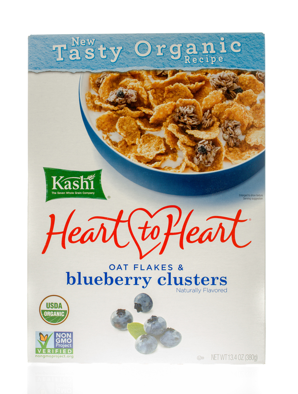
The Brilliance of Kashi’s New Packaging
October 18, 2016The Stripped Down Trend Sells

In the most recent blog post, we wrote about some of the trends seen in the baby goods market. It is important to understand that the trends seen there are not the same seen in other markets. In fact, in many cases they stand in direct opposition. While we said bright colors, and eye-catching graphics are winning in the baby market, for all others, there has been an effort to simplify design.
Food bags and other flexible packaging is being stripped down to the most basic designs, which utilize very few colors, and in some cases, are printed fully in black and white. That, for many startups, is excellent news, as they attempt package printing on a very tight budget. The fewer colors, the less detail in the graphics, the less cost to print, in most cases.
Not only do you save money up front, but done correctly, the minimalist design movement can really sell consumers. This is exactly why even the biggest brands are rethinking their usual packaging products. They are paring down their usual graphics, creating a look that might almost be considered a ‘throw back’ to simpler times. That, right there, is the feeling that many consumers are seeking. Walking into the busy grocery streets, using the limited amount of free time they have between work responsibilities and the demands of home, buyers are looking for something that is simpler. The pared down designs on stand up pouches are reminiscent of a quieter time, and far less overwhelming in the overcrowded stores.
Some are taking the minimalist design principle even further, including very little printing, and instead, opting for transparent, flexible packaging that allows the product to speak for itself.
Here are a few tips for you, if you are shooting for a simplistic design on your pouch packaging:
- Make the font engaging, but clearly readable. Allow it to stand in high contrast with the rest of the packaging. Make it clean, clear and large enough to see at a distance
- Avoid unnecessary graphics
- Have a product that looks pretty on its own? Let it show through.
- Make function a top priority – simplifying the packaging should not extend to functional elements. Customers are busy today, in need of quick, easy to use, simple to access solutions. Never sacrifice functional design