
Why Is Effective Packaging So Important?
April 26, 2016
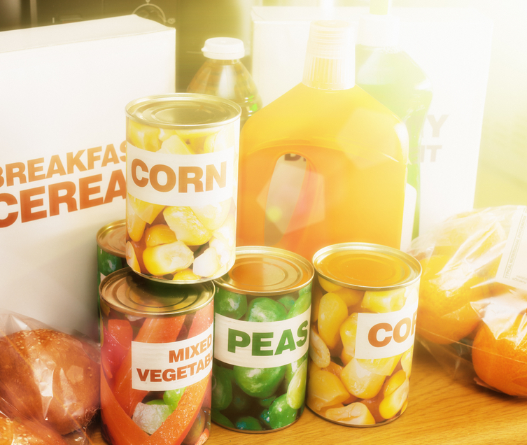
Selling Your Packaging to Retailers
May 3, 2016
Visual appeal is one of the most important factors to consumers. It can immediately draw people to your product or packaging or turn them away. When you are ready to design packaging labels, keep this in mind. Each color can invoke a different feeling in your consumer. Think about what you want to convey with your packaging. Also, remember your own logo or slogan’s color scheme. Be sure to utilize these colors to increase your brand awareness.
Colors evoke emotions. Research done at the University of Winnipeg, Canada, states that 62-90% of the decision to purchase a product is based on color. Use a color wheel to ensure you use enough contrast on your label to make it easily readable and pleasant to look at. The higher the contrast, the easier it will be to read. Let’s look at colors and what feelings they may evoke in others.
Black
Black is usually associated with luxury and sophistication. Use this color if you have a high-end or luxury product.
Blue
Banks often utilize blue, as it evokes feelings of security and trust. It is also a soothing color and creates a feeling of calmness.
Red
Red is often used for clearance sales or time sensitive promotions. This is because it suggests a sense of urgency. Numerous fast food restaurants use red in their color scheme.
Green
The color green has become synonymous with nature and growth. If you are selling an earth friendly service or product, this is an easy way to show you are environmentally friendly.
Yellow
This color can bring in the eye of any customer. It easily grabs attention. Use it to highlight something important.
Be sure to take the time and research your color scheme before creating your next label. This will ensure you understand the feelings and emotions your label may evoke in your customers.